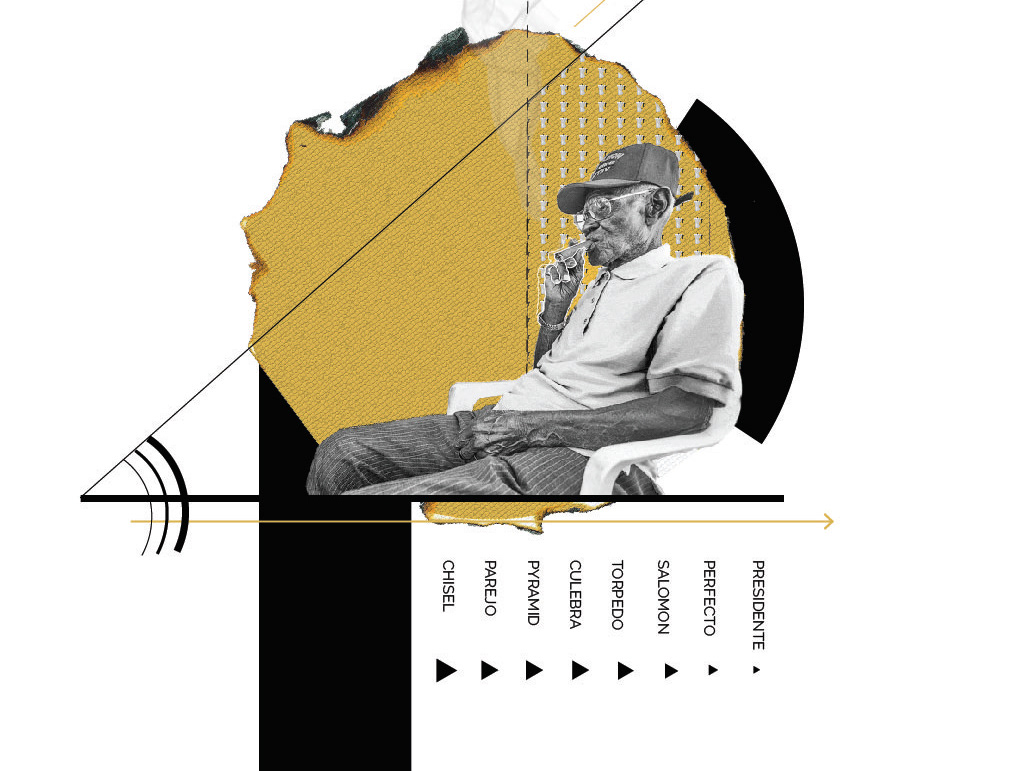
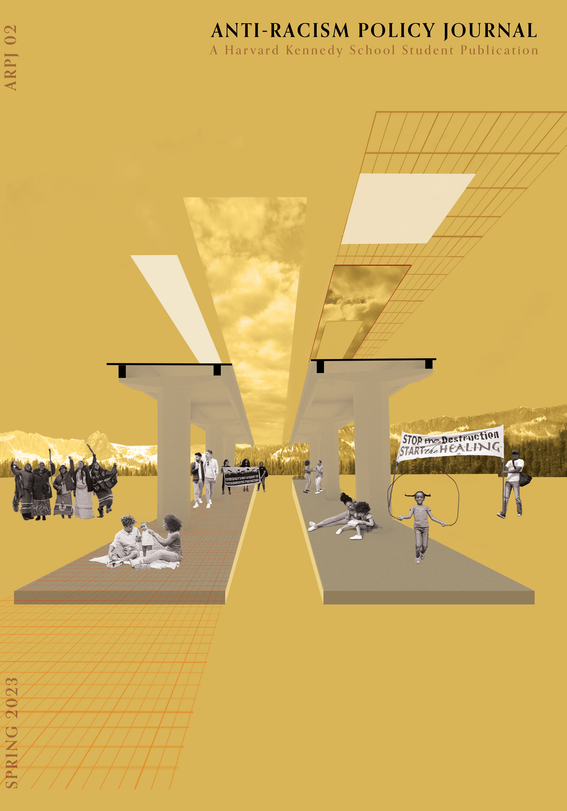
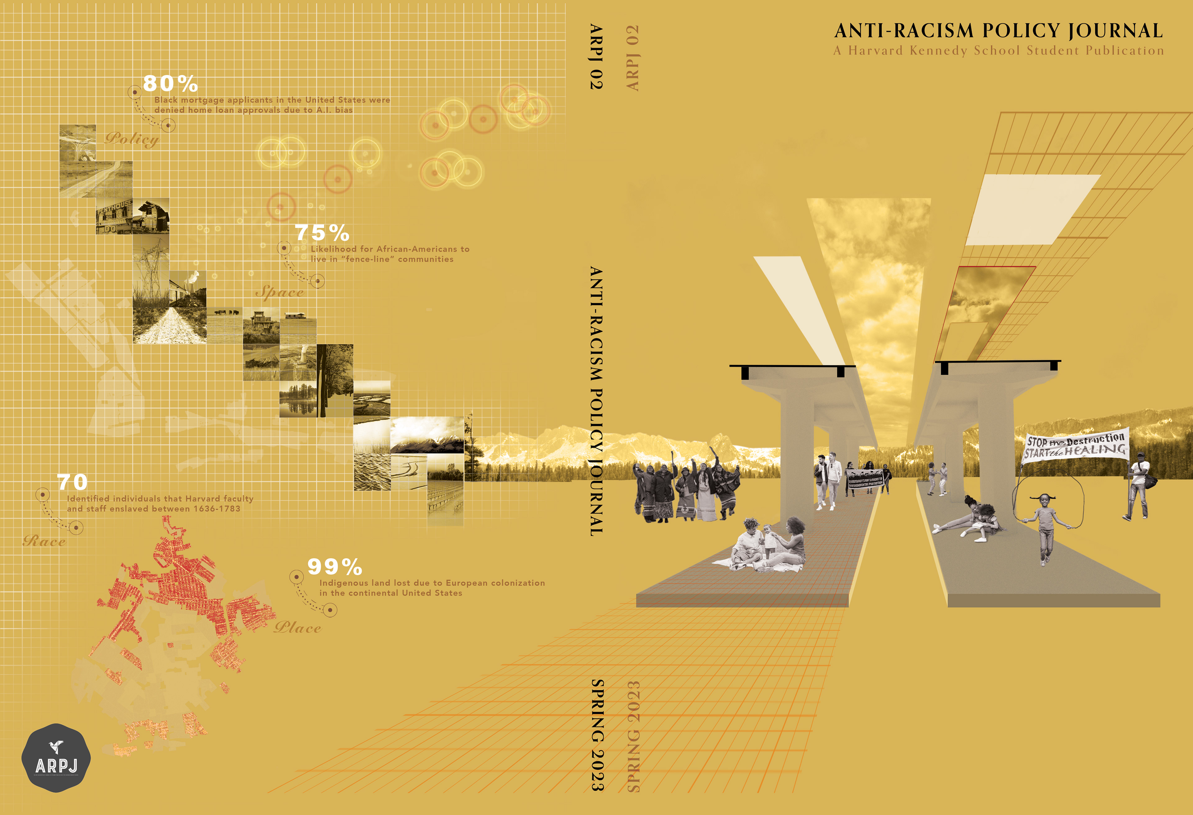
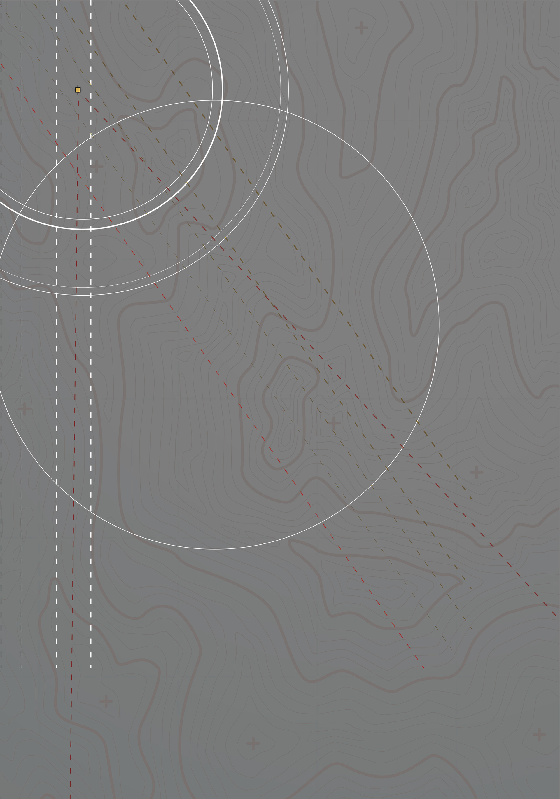
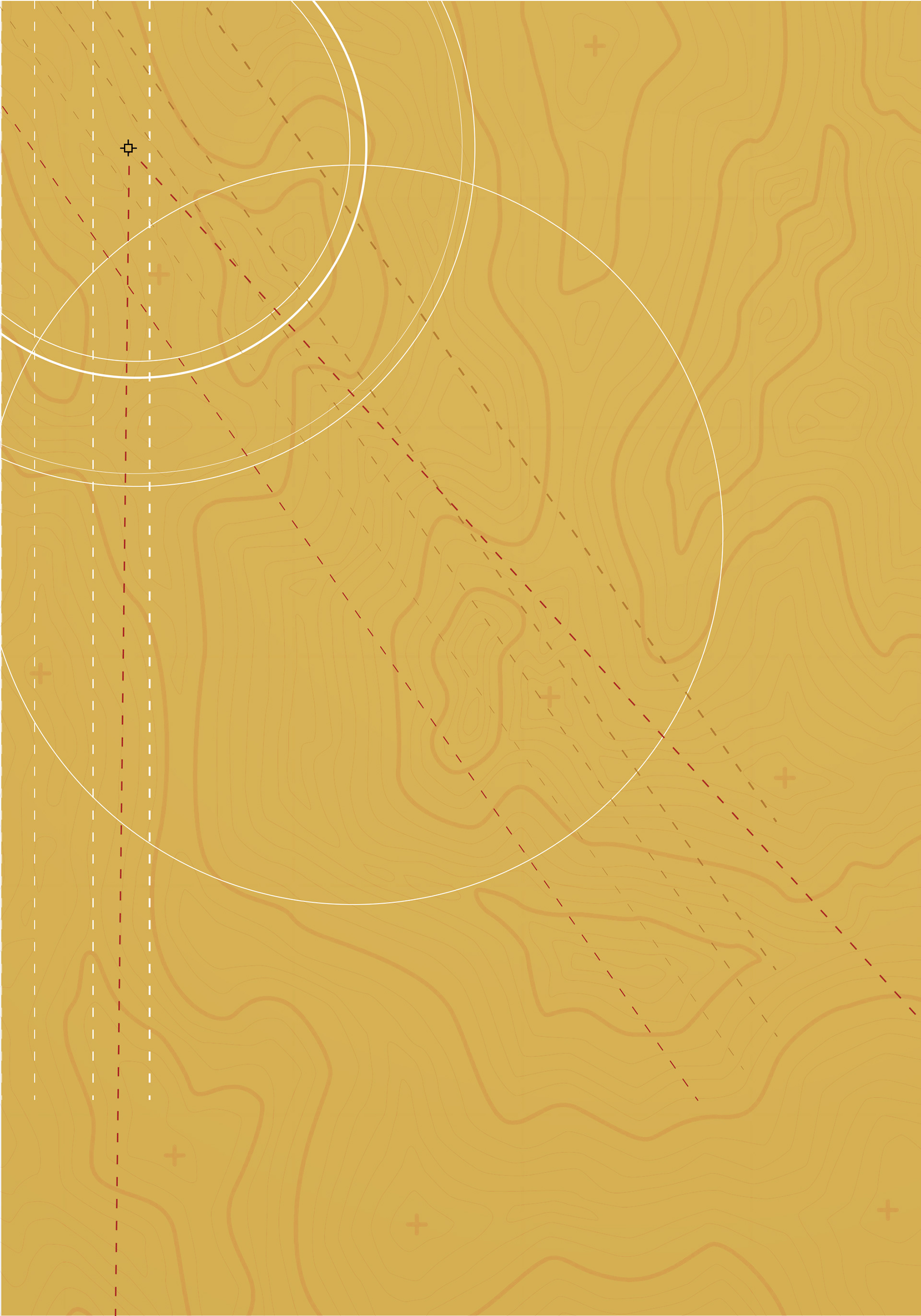
The editors-in-chief were drawn to my work on the MoMA: Blackness and Architecture in America exhibition, so we chose to stick to a gold and grayscale color palette and add Harvard's classic crimson to the mix. The front cover image was heavily inspired by a collage a designed for the MoMA exhibition.
FULL SPREAD COVER
In early discussions of a print version of the journal, I gave extra attention to what the book cover would look like when being held open. My vision was to create an image for the front and back covers that could each stand alone but also served as a cohesive spread.
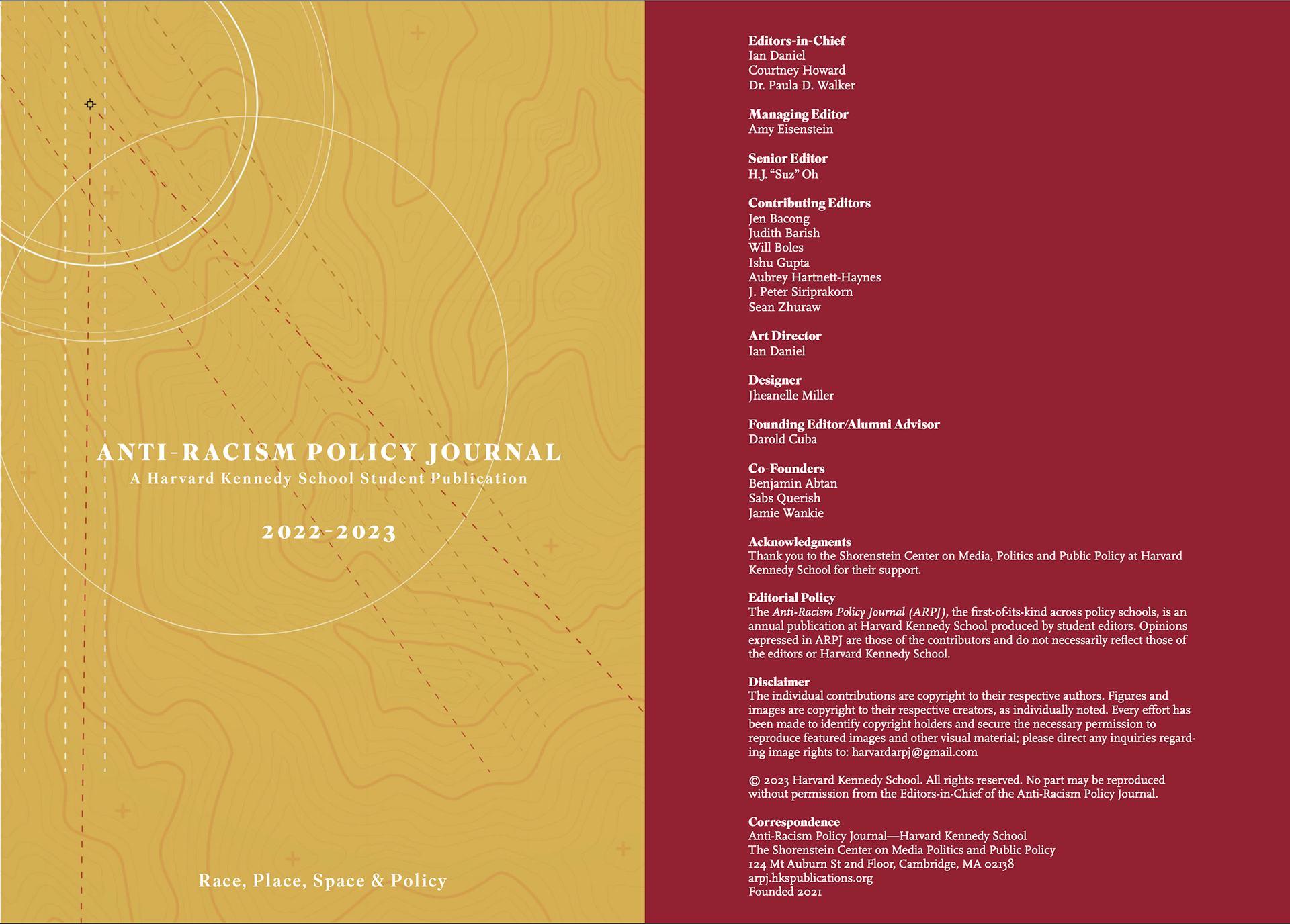
ASSET TEMPLATES
As a team, we were aware that as the design layout was being created, new essay entries would be coming in ad getting approved. Therefore, I decided to create a set of assets based on our color palette choice that we could plug and play into the template as desired for each submission. I created a combination of full spread graphics as well as graphic headers.


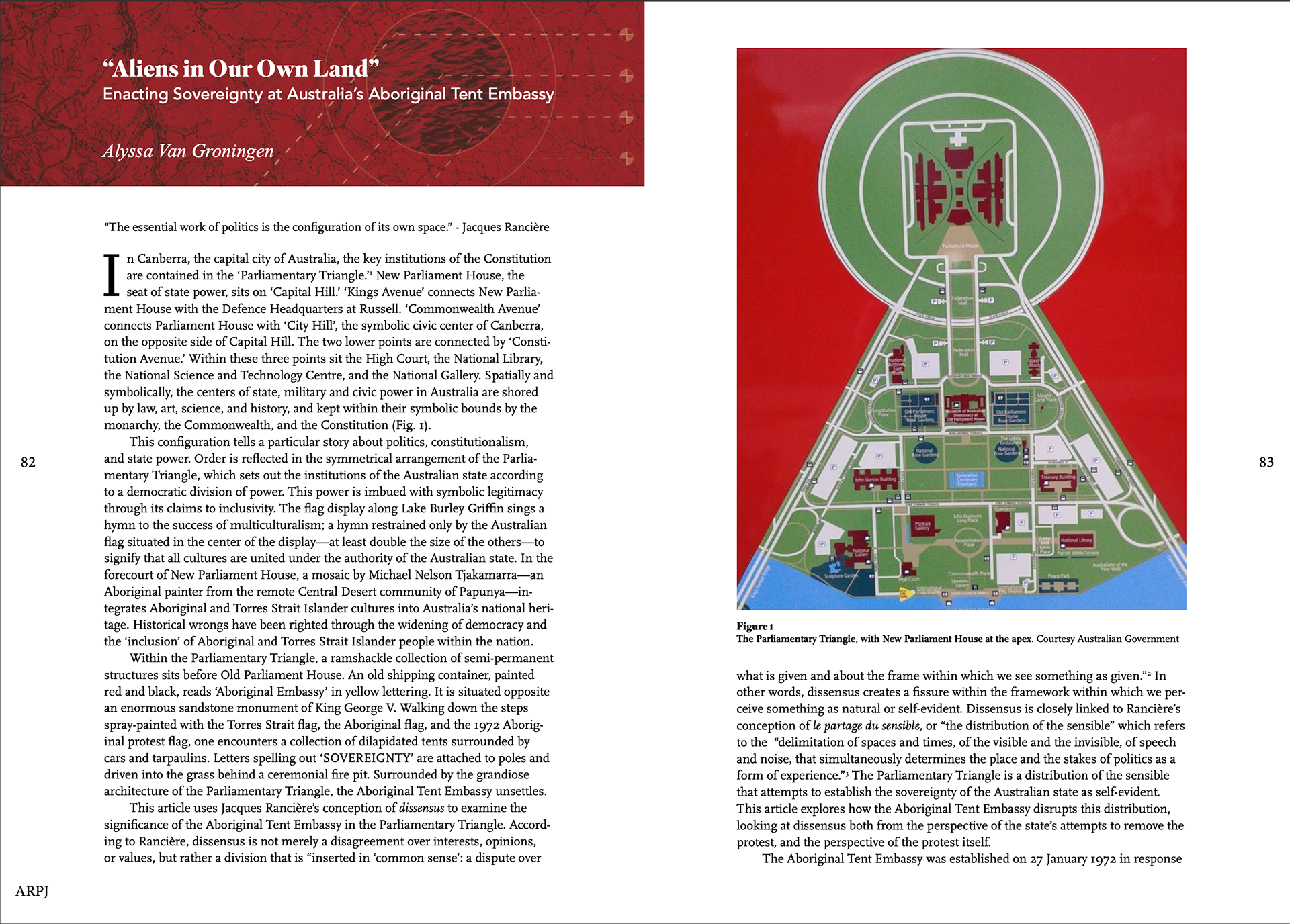
UNIQUE LAYOUTS
Given that there were a few submissions that were not essays or interviews, I created layouts unique to those submissions.